
Are you paying attention to the readability of your content?
 If your focus is on technical terminology and a beautiful page design, then the chances are that readability is a little further down your priority list. Unfortunately, it might be the element of quality content you need to master before you find success online. After all, if readers can’t enjoy what you’ve written, you can’t expect them to stay on your page and remain engaged.
What Is Readability?
In essence, readability is the quality of writing and language use that makes it easy to read, as well as understand.
Wikipedia expands on this concept by detailing metrics observed in an effort to measure readability. These include…
“…speed of perception, perceptibility at a distance, perceptibility in peripheral vision, visibility, the reflex blink technique, rate of work (e.g., speed of reading), eye movements, and fatigue in reading.”
Although there are many formulas to score readability, few of them factor in the design, organization, visual elements, content, and purpose of a text.
What Affects The Readability Of Your Writing?
Readability takes into account reading ease, your writing style, the quality of your language, and the level of reading comprehension. However, it also factors in the design and presentation of your writing. While these latter elements technically fall into the category of legibility, they aid in improving the readability of a text as they influence user experience. How the words on your page look can affect the speed at which a reader is able to work through a piece of text. Although you can’t control every aspect of readability, there are some things you can do to enhance a reader’s enjoyment.
Why Is Readability So Important?
The reality is that very few people read web pages word by word these days. Instead, they prefer to scan for words and phrases that help them get the gist of what you’re saying without wasting precious time. It’s for this reason that readability has serious implications for the way you structure your content marketing messages.
When we read, our eyes don’t move across a page smoothly. Rather, our eyes make discreet jumps from word to word, fixating on each one for approximately 200-250 milliseconds. While this is happening, there’s a cognitive process taking place that allows us to recognize the shape of a word and then translate it into something that has meaning. When we scan or speed read, we expand our eye span to incorporate clusters of words so that there are fewer eye movements.
Good readability ensures readers are able to scan quickly, process the piece of text they’re seeing, and then understand its meaning. As a result, readability should be a priority if you hope to influence as many people as possible with your message.
18 Tactics to Help Get Your Content Read
To ensure your content is not only easy to read, bust also remains competitive within a noisy online environment, here are 18 best practices for improving the readability of your writing:
1. Use a good font size
While you don’t want your text to be too big, you also don’t want it to be too small, as it can lead to eyestrain. Thankfully, modern web design not only caters to a variety of devices and display resolutions, but it also allows for a flexible, scalable approach that adapts to personal browser settings. Use percentages rather than absolute sizes when setting the size of your fonts.
2. Maintain a reasonable line height
The line-height property establishes the amount of white space above and below each line of text. Also called leading, a good line height provides clarity by ensuring the shapes of letters and words are recognizable. Although your line spacing will depend on your font size, the following example shows you how leading can hamper readability.
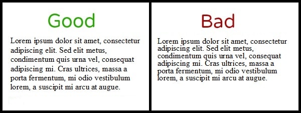
Be careful not to provide too much line height as it makes your use of vertical page space inefficient.
3. Use a clean and simple font style
There’s no denying that font styles can get complicated, resulting in bad design choices that destroy the legibility of a text. Even in cases where the most legible typeface is used, a font’s creative elements might not lend itself to easy reading.
As a result, you should avoid styles that are too edgy, fancy, or decorative. Differentiate between headlines and the paragraphs that follow, but make sure you use a typeface that’s compatible with good web design and user experience. Consider using sans serif fonts like Arial, Geneva, Helvetica, Verdana, Trebuchet, or Tahoma as they lack small finishing strokes that easily blur together. Alternatively, you can try a reasonably designed serif font with as little distinct flair as possible.
4. Use short sub-headlines
Since people tend to skim content, it’s crucial to use short, meaningful headlines to break up monotonous text patterns. Besides making a web page easier to read, sub-headlines act as a teaser and indicate that the following paragraphs contain a new idea. Ideally, a sub-headline should be bold and slightly larger than the content below it.
5. Be smart about paragraphs
Most readers find that large blocks of text are hard to digest. Thankfully, chunking can help alleviate this problem. Besides adding necessary white space for improved scannability and readability, paragraphs give structure to your written work.
Here are some things you should know about creating smart paragraphs:
- While conventions for length vary, paragraphs should be adapted according to medium, subject, and audience. Ideally, a paragraph should be no less than three sentences and no more than six.
-
Try not to add more than three paragraphs under a single heading.
- Make sure each paragraph contains a single, developed idea.
- Use connectives like “Nonetheless,” “Besides,” “However,” “Furthermore,” and “Alternatively” to unify your writing between and within paragraphs.
-
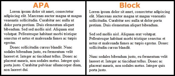
Paragraph shape can vary depending on the text you’re chucking together. While APA guidelines call for an indent on the first line of text and no white space between paragraphs, block paragraphs are more appropriate for readability on the web.
6. Keep your writing simple and consistent
Concise, simple, and focused writing keeps your message clear. Jargon throws readers off while inconsistency confuses them. As a result, you should keep your sentences short and get to the point quickly. Bear in mind that your tone and use of punctuation also affects the readability of your content.
7. Use bullet points and numbered lists
Bullet points and lists grab attention, create white space, help structure content, and aid in the consumption of information quickly. All of these benefits contribute to easy reading and better comprehension.
8. Use a combination of uppercase and lowercase letters
A mixture of capital and lowercase letters is easier to read than sub-headlines and content that consists purely of uppercase text. The difference in letter height assists with scanning while a combination of cases gives words shape. In turn, readers recognize words quickly, which makes for easier reading.
9. Apply style choices appropriately
Using italics, making certain words bold, or highlighting keywords can help emphasize the information you’re trying to deliver. However, you need to consider these style choices carefully as they can help with scannability, but hinder readability if there are too many.
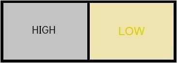
10. Avoid poor contrast
In addition to annoying readers and weakening engagement levels, low contrast text can cause eye fatigue. This is especially true for readers who are visually impaired. Therefore, you should think about readability first and visual appeal second. If you opt against classic color combinations that include darker text on a lighter background, be sure to consider things like color brightness.
Examples of high and low color contrasts
You might also want to think about building typographic contrast into your headlines and sub-headlines by making them noticeably different to the type you’ve used for your paragraph text. A larger or darker text for headlines is ideal for guiding readers through your content.
11. Avoid busy backgrounds
There’s nothing like a noisy background to distract visitors and hinder readability. Case in point:
If your website or blog has a creative background image, make certain that the layer behind your text doesn’t interfere with the way words look or an individual’s ability to read them.
12. Leverage images with captions
Breaking text patterns with visual stimuli like images can make a piece of content easier to read, as well as help readers remain focused. Captions on images are also a popular reference point for scanners since an individual’s eyes tend to drift down naturally when seeing an image. Therefore, you should not only consider images that support your text, but you should also include persuasive, interesting captions that compel people to read further.
13. Avoid awkward text wraps
Wrapping text around images or other elements often causes text to break awkwardly. This interrupts a reader’s rhythmic eye movement and interferes with an individual’s scanning speed. Text wraps also create blank lines, thin columns of text, and issues with hyphenation. If you do choose to use a text wrap, make sure it lends itself to a well-balanced design and that it enhances readability rather than hinders it.
14. Use an inverted pyramid
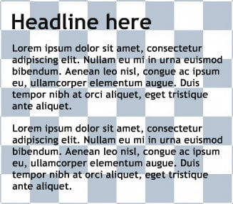
If you’re unfamiliar with the inverted pyramid, then look at this eye tracking research published by the Nielson Norman Group.
Eye tracking study: Heatmaps from three different websites indicate where readers focused most. Gray areas failed to attract fixations while red areas were looked at the most.
If you scour the web, you’ll find many different opinions regarding the inverted pyramid as a style of writing. Since most readers search for the content they read, the belief is that they’re already interested in what you have to say. However, it’s crucial to realize that the hook and setup for a good piece of writing needs to be at the top of the page where a reader’s eyes naturally go when viewing content. Other readability factors and your call to action won’t matter if you can’t get people to move past the headline and first few paragraphs.
15. Keep lines of text a reasonable length
Long lines of text that travel across an entire web page are frowned upon when it comes to reading comfort. They’re hard on the eyes, and they cause fatigue. You also increase the chance of readers losing their place. Although you don’t necessarily want multiple columns, you should at least use a single column to control the width of your text. Ideally, you want to aim for 50-60 characters before the sentence breaks off onto the next line.
16. Avoid clutter
Clutter can affect the readability of your text, as well as dilute its relevancy. A clean, professional, and streamlined look will prevent distractions and improve a reader’s experience.
17. Make sure links look like links
Although there are many conventions for making a link look like a link, the important thing here is to use them wisely when assessing the readability of a page. Too many links can be distracting, affecting a person’s retention of information and drawing readers away from your article. Links placed appropriately within your text can improve scannability. Words or phrases that are underlined but aren’t clickable can frustrate readers and decrease user experience. Therefore, you should pay attention to your linking habits and only use links when necessary.
18. Check your text with a test
Readability tests and standards can help ensure your writing style meets the reading level of your target audience. While formulas and scoring measures may differ, these tools provide similar results in terms of understanding the reading ease of your content. Most word processing software contains built-in readability tests these days, but you can always search for testing tools online to check your text.
Common readability tests include:
- Flesch Kincaid Reading Ease: This formula produces a result that’s measured on a scale of 1-100. The higher the score, the easier the content is to read.
- Flesch Kincaid Grade Level: Results are given according to academic grade level, with a 7th-8th grade reading level being a recommended standard.
- SMOG Index: This test also scores text based on a grade level between 1 and 12.
- Cloze test: This formula offers a great way to measure readability and reading comprehension. You should aim for a score of 60% or more.
- Gunning Fog Index: While this scoring scale starts at 1, complex text can reach index readings in the high teens. However, you should aim for an index reading of 8 or less for a universal understanding of a specific piece of content.
Online tools you might want to try:
- The Readability Test Tool
- Readability Formulas
- Readbility-Score.com
- Online-Utility.org
- Content Manager by Raven Tools
- Juicy Studio
- Edit Central
The great thing about many of these tools is that they allow you to measure content you’ve already published. When the option is available, simply insert the relevant URL into the search field, click the accompanying button, and then wait for the tool to work its magic. This gives you an opportunity to find blog posts or pages of content that require improvements in the readability department. As you practice with these tools, you’ll find it becomes easy to write content at a comfortable reading level.
Conclusion
Effective communication is essential for content marketing success. The way you write and structure your content influences the way readers consume your message. By practicing design literacy and making readability a priority, you ensure your target audience enjoys your content and receives your key message even when they’re simply scanning.
Shawn Manaher is the founder and CEO of The Content Authority. He’s one part content manager, one part writing ninja organizer, and two parts leader of top content creators. You don’t even want to know what he calls pancakes.